EXPLORE REFERENCE PROJECTS
- Back
STUTTGART 21, STUTTGART, GERMANY
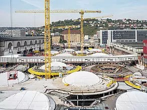
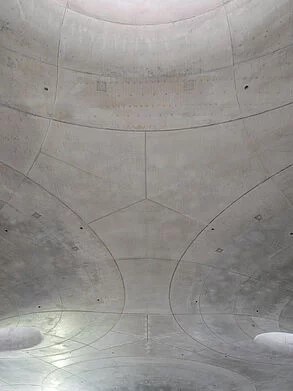
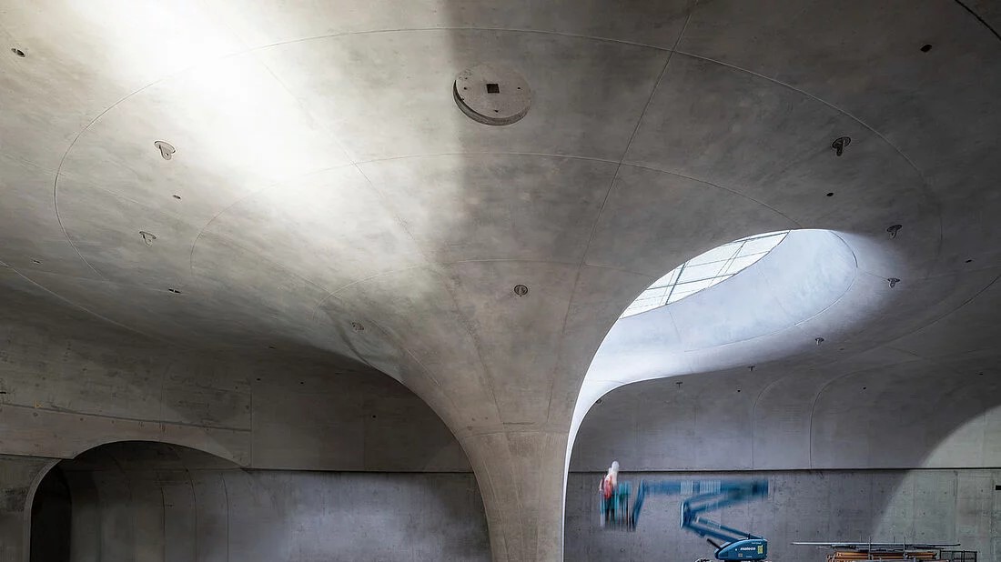
The new concourse at Stuttgart’s main railway station is a masterpiece of engineering. Designed by ingenhoven associates and Frei Otto, the freely curved shell roof is nearing completion: the concrete surfaces are currently being carefully reworked to emphasise the elegance of the flowing forms. The company beconart is using KEIM products for this purpose.
Project Summary
PROJECT
STUTTGART 21, STUTTGART, GERMANY
Architect
ingenhoven architects gmbh
Builder
DB-Projekt Stuttgart-Ulm GmbH
Photos
Sebastian Hopp, Architekturfotograf
SHADES OF GREY – CONCRETE DESIGN AT STUTTGART 21 RAILWAY STATION
Stuttgart’s future main station forms the centerpiece of the major Stuttgart 21 project. An underground, 8-track through station will replace the existing 16-track terminus station. As a result, above-ground railway facilities can be abandoned on a large scale to create space for an entire new city district.
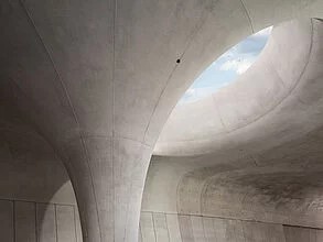
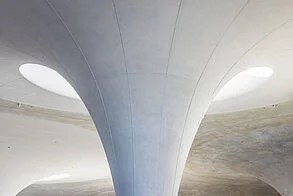
The central element of the station design is the accessible roof, half of which serves as an urban square and the other half as a green part of Stuttgart’s palace gardens. The shell roof is supported by 28 chalice-shaped columns made of white-colored exposed concrete. Their free-flowing, organic shapes lend the underground space a unique atmosphere unlike any other railway station. The chalice-shaped supports open upwards to form so-called light eyes, which provide brightness in the hall.
A shell structure in this form has never been built before. It combines engineering and aesthetics in an impressive way. The complex structure, which is 450 meters long and 80 meters wide, consists of freely curved surfaces that follow the exact course of the static forces. The construction uses very little material: in the center between the goblet supports, the concrete shell is only 40 centimeters thick – with a span of around 35 meters.
DEMANDS ON EXPOSED CONCRETE
As usual, after stripping the formwork, the concrete did not yet show the perfection that would later characterize the impression of the room. In some places, the formwork panels had slipped slightly against each other, so that the concrete surfaces had projections and recesses of a few millimeters. As the goblet columns are always bathed in grazing light from above, these irregularities cast shadows and were particularly noticeable. The very heterogeneous surface qualities of the concrete also did not meet the architects’ requirements at all: some of it was matt, some slightly shiny and some showed different discolorations. This was because it was sometimes darker, sometimes lighter in color due to various factors during production, such as the outside temperature, the time spent in the formwork, the formwork oil used and varying degrees of compaction. In addition, there were also traces of the construction process, such as marks from temporary supports on the slab surface. The anchor holes and some of the joints were technically unavoidable, but undesirable in terms of design, as they visually disrupted the elegant curve of the goblet supports. It was therefore clear that the surfaces needed to be improved. The concrete retouching was tested on a sample column. After around ten reworkings, the desired appearance was finally achieved.
FILLING, ADJUSTING, LEVELLING
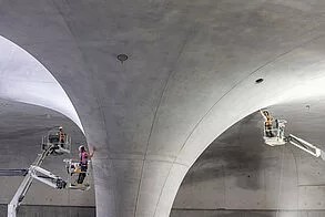
So, they set about designing the concrete, using KEIM’s mineral product range at the suggestion of the contractor beconart. First of all, the unevenness was levelled out. To do this, protrusions had to be removed, recesses and cavities filled and breakouts at the edges levelled out. The anchor holes in the ceilings were closed with glued-in cones: Larger cones were screwed into the underframe openings and glued in place. The respective areas were then roughened and smoothed with fine filler to match the surrounding areas. The craftsmen proceeded in a similar way for those joints that the architects wanted to disappear completely.
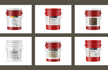
A color match was planned for the large areas, which had to fulfil contradictory requirements: on the one hand, it was to harmonize the different tones of the individual areas, while on the other, the concrete was not to disappear under an opaque layer of paint but retain its stony character. This is where the “Concretal glaze” was able to play to its strengths. As a mineral system, it preserves the visible, open-pored structure of the concrete as it does not form a film on the surface. In order to achieve the most natural look possible and allow the concrete to shine through, the glaze was first diluted with “Base” and “Fixativ”, then applied with an airless device and roller and then blended by hand using a natural sponge. This creates a slightly cloudy appearance that resembles untreated concrete. After two work steps, the beconart team adjusted the still translucent imperfections (application and strong color deviations) to the surroundings with local retouching. The same was done with the areas previously closed by coning.
WORKING IN HARSH CONDITIONS
In total, around 60,000 square meters of exposed concrete and almost 100 kilometers of joints were repaired in this way. “At times, it was a real back-breaking job,” explains beconart Managing Director Martin Berger: “We had to work overhead on large areas under the ceiling, which required various work platforms to reach heights of up to 15 meters. On average, we were on site for three years with 12-15 people to finish the exposed concrete. While we were already reworking the first removed chalice supports at one end of the construction site, new chalice supports were still being cast at the other end.” By working in parallel, at least this trade is well on schedule. If nothing else comes up, the surfaces will be finished in autumn 2024, a few months earlier than planned.
Travelers who use the station after it opens will have no idea that the elaborate, almost restorative treatment of the chalice supports and ceilings has been carried out. The concrete looks completely natural, as if it had come straight out of the mold. The architects’ spatial concept, which emphasizes the dynamism and elegance of the curved concrete forms, can then unfold its effect undisturbed.

